USDA Redesign
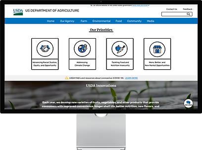
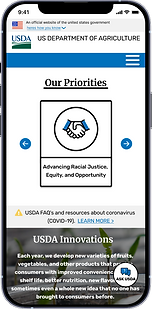
THE PROBLEM: The USDA website is outdated, the cards & icons are inconsistent, and there is an overload of information. Users are overwhelmed by the amount of poorly organized information and resort to the search bar to find everything.
THE SOLUTION: I created a new version of the USDAs' website by applying modern design principles to the USDAs' classic branding. I cut down on the amount of information by recategorizing topics, creating new layouts, and creating carousels. I created consistent branding throughout the entire site by creating new icons, cards, and by using a set color palette.
My roles: UX designer, UI designer, UX researcher
Tools used: Figma, FigmaJam, Google Slides
Timeline: 3 weeks
User Research
Usability Test Plan
I interviewed 6 people to see how well they were able to interact and complete tasks on the USDA website. Each user was given 3 specific tasks to complete on the website.
Key findings from my usability tests were:
-
Too much text to filter through
-
The site is difficult to navigate
-
No help available on each individual page
-
No warning when leaving the current website
-
Users rely on the search bar
-
Some of the UI feels outdated
Usability Test Results Priority Matrix
I removed the redundant data and arranged my results into a priority matrix to help determine which issues I needed to focus on the most. I determined all of the issues I found during testing need to be addressed.

Redline Annotations
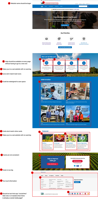
The next step I took in the redesign process is to annotate the main navigation, the homepage, the grants and loans page, and the search page. These are the 3 pages I will be redesigning. I did this to map out issues I believe need to be improved.
My key findings from analyzing the websites navigation:
-
The drop down menus are too long
-
Name of site is too small
-
Menu items could be organized better
-
Search bar looks outdated

1

2
3
4
Summarized key findings from analyzing the homepage:
-
The hierarchy of the webpage needs to be improved
-
Help should be available on every page
-
Not all external links are visible to users
-
Icons and cards are not consistent
-
Some content could be redesigned or removed to save space
-
The footer is too large and has too much content
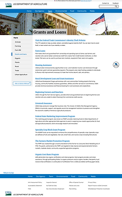
Summarized key findings from analyzing the grants and loans page:
-
The hierarchy of the webpage needs to be improved
-
Some content could be redesigned or removed to save space
-
The footer is too large and has too much content

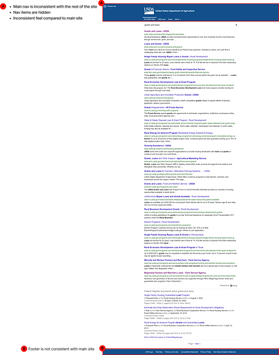
Summarized key findings from analyzing the search page:
-
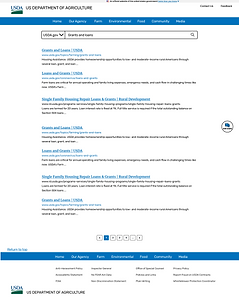
USDA icon is not consistent with main site and does not take you to home page
-
Site colors are not consistent
-
Site nav is hidden in hamburger menu and is not consistent with usda.gov
-
Footer is not consistent
Card Sorting
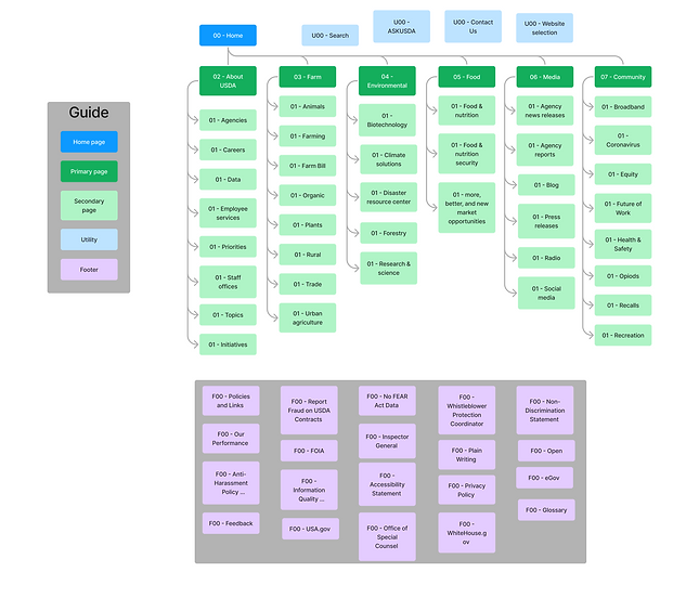
After completing the annotations I started the card-sorting process to help evaluate the information architecture of the newly designed website. I took all of the pages in the navigation and footer and reorganized them into new categories to get rid of the long drop-down menus and help users find information more easily by cutting down on excess content.

Site Map
Next I took the newly established information architecture from the results of the card sorting and created a new sitemap.
Wireframing
Navigation
First I redesigned the navigation because it guides users to the rest of the content on the website.
Main nav web:

-
I created more main nav options to cut down on the size of the drop down menus and to help users find information more easily
-
I added the “select department” option to filter through the different departments so there is always a way to return to the home page
-
I changed the hierarchy of the website name so its easier for users to know what site they are on
Main nav mobile:

-
Made the mobile nav consistent with the web by using the same text and icons
-
Put the main & global navigation options into a hamburger menu to help with space and ease of access
Footer web:

-
I organized the bottom nav links in alphabetical order
-
I added “social media” to the social links at the bottom to help users identify them
-
I removed some of links at the bottom that you could find in the drop down menus
Footer mobile:
-
Kept the mobile footer consistent with the web footer by providing the same text, links, and icons

Homepage Wireframes
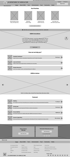
Web homepage:
-
Changed the layout so the priorities of the USDA are the first thing you see to help users understand the purpose of the USDA
-
Turned all of the cards into horizontal cards to make them consistent
-
Turned the USDA in Action section into a carousel to help save with space
-
Created the Ask USDA chat bot icon so users have help on every page
Mobile homepage:
-
Kept the mobile home page consistent with the web version by using the same cards, icons, and components

5 Second Testing
I performed 4 - 5-second tests on my web & mobile navigation to understand users' first impressions of my website and to see how well it communicates its purpose.
Key insights from 5-second tests:
-
Having the priorities first made it easy to understand what my agency's purpose is
-
The abundance of white space made the website feel well spread out
-
The navigation is well spaced out and the dropdowns aren't too long
-
Select department option unnecessary
UI Elements, Components, Mockups
Iterations Made Based on 5 Second Test
Website nav:

-
Removed select department feature after receiving feedback and determining it was not important
-
Changed “About USDA” to “Our Agency” to better inform users what info can be found on the page
Web footer:

-
Changed “About USDA” to “Our Agency” to match main nav
Card & Icon Design Process
Making the icons
-
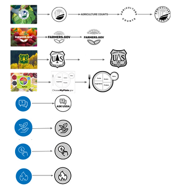
I recreated the icons using the pen tool and plugins to match the original icons that were at the top of the homepage
-
I changed the ASK USDA card into an icon that opens up a help chat
Making the cards
-
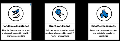
Turned the icons from the top of the home page into cards
-
I changed the colors of the icons to match the website
-
Created consistency by making all icons and cards have the same colors and shapes
-
Added an exterior link icon so users know the card will take them to a new website


AskUSDA Redesign
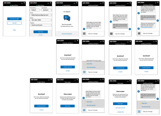
AskUSDA was a FAQ and live chat page. I created a live chat that is available on every page so users always have easy access to help. I designed a web and mobile version.
Web version:
-
I created a new special icon to represent the AskUSDA live chat
-
I redesigned the live chat itself and created a functional component
-
When the ASK USDA chat opens you can choose to chat with an agent or go to the FAQ page
Mobile version:
-
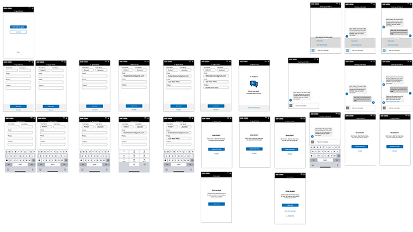
Made sure mobile UI is consistent with web UI
-
Added keyboards
-
Enlarged chat to fit a mobile screen
Testing and Iterating
Usability Testing Plan
My main goal is to understand if my redesign helps users find information more easily.
I tested 7 users on the web & mobile prototypes. Each user was tasked to locate the grants and loans page using the 4 paths created.
The 4 paths are:
1. The search bar
2. The Ask USDA help chat
3. The grants and loans option under the farm drop-down menu
4. The grants and loans card on the homepage
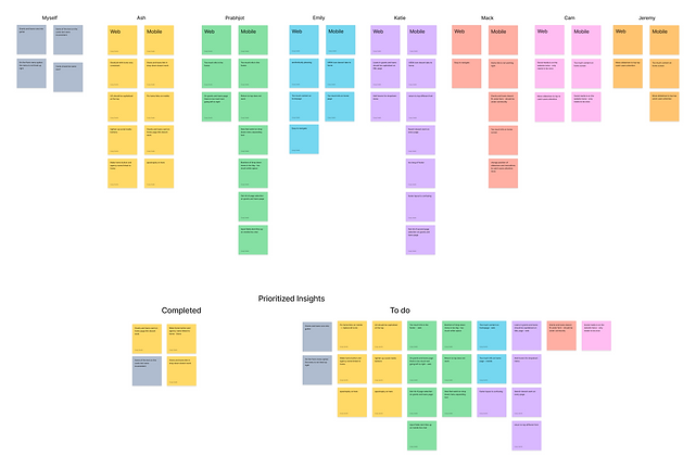
During my testing, I gained a large number of insights. The key insights I gained are:
-
Too much content on mobile home page
-
Too much content on the footer - web & mobile
-
The page selection on grants and loans page needs to be removed because its already in the main nav
-
The website title should return you to the home page just like the USDA icon does
-
Too much text on the grants and loans page
Iterations made based on testing:
-
Created carousels for cards on mobile version
-
Removed unneeded content from footer
-
Reorganized mobile footer
-
Removed page selection from mobile grants and loans page
-
Made the website title return users to the home page
-
Cut down on text on grants and loans page
-
Made “return to top” feature work on every page on mobile and web
-
Made the search feature work on every page
-
Fixed prototype flow errors
Final Design
Web Version

Mobile Version


Final Thoughts and Conclusion
The USDAs website design is outdated, difficult to navigate, cluttered, inconsistent, and not user-friendly. I created a new, modern, user-friendly website that uses consistency, white space, and hierarchy to create an easy-to-use accessible experience for users.
Going forward I will be conducting a new round of usability testing to learn if my iterations improved the experience for my users. I will also redesign more pages on the USDA website.